I've been really interested in the website Dribbble lately. It is described as: "Show and tell for designers in 120,000 pixels or less."
There is a lot of nice artwork featured on this website, and unlike some art websites such as DeviantArt, this one does not allow just anyone to sign up, and post artwork. In order for one to get a membership, they have to actually receive an invitation from a current member, which is a great way to ensure that only the highest quality possible artwork is featured on the site. Not that everyone on there is amazing, but at least you don't have complete amateurs posting whatever they feel like.
The main reason why I enjoy this website, and felt it was worth posting for others to see, is that it's a great source for inspiration when creating artwork. It's a really good way to see what other designers are currently putting out, not necessarily to copy them, but to at least be aware of what others in the field are doing.
Sunday, December 12, 2010
Sunday, November 21, 2010
Exljbris Font Foundry
Jos Buivenga is a Dutch type designer that offers many free typefaces on his website. Usually there are many available weights and styles, and only one or a few will be free, while the rest are for sale. I have found his website to be a great resource for picking up some extra fonts that you wouldn't find at a regular free font website, and so I thought anyone reading this might find it useful as well.
Here is a list of the offered typefaces: Anivers, Calluna, Delicious, Diavlo, Fertigo Pro, Fertigo Script, Fontin, Fontin Sans, Geotica, Museo, Museo Sans, Museo Slab, Tallys.
Leave a comment and let me know if this was useful for you! A couple of my favorite typefaces designed by Jos are Diavlo and Fertigo Pro. Which are your favorites?
Wednesday, November 17, 2010
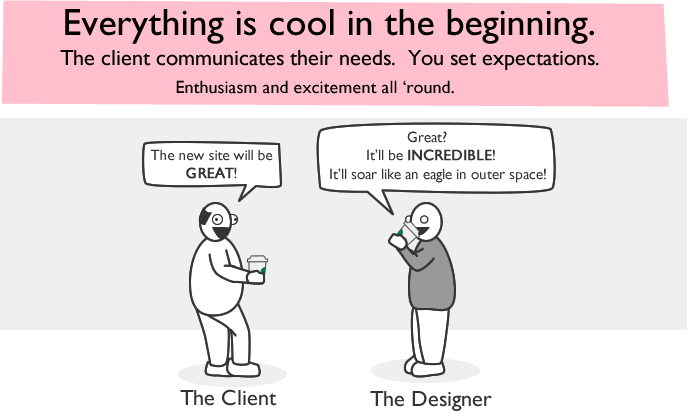
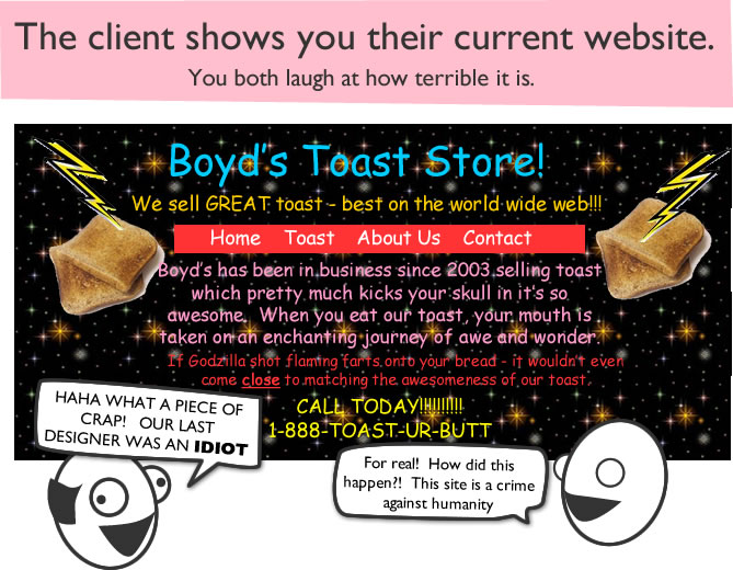
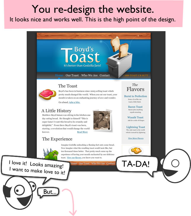
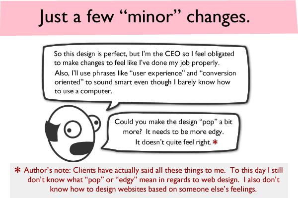
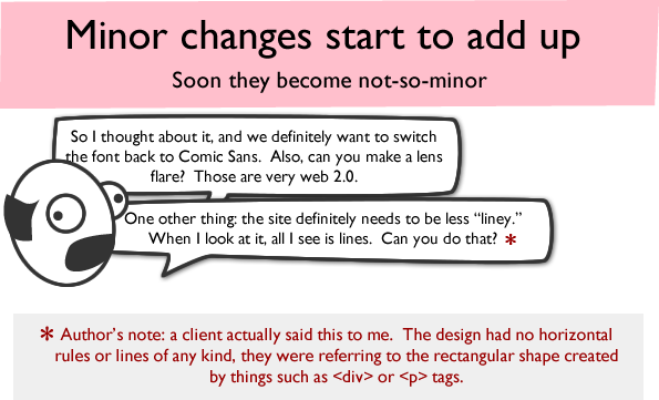
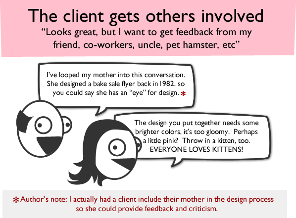
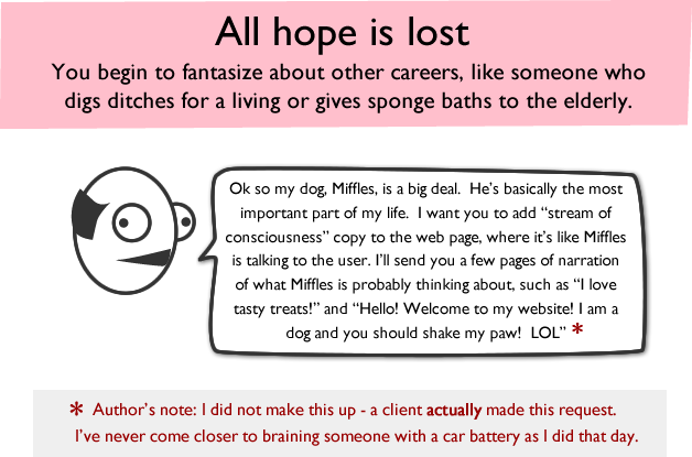
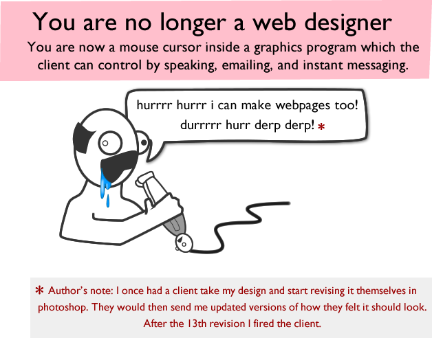
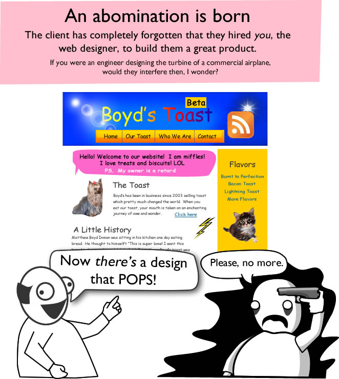
The Oatmeal: How a Web Design Goes Straight to Hell
I'm a big fan of The Oatmeal, a webcomic drawn by Matthew Inman. In this particular comic, he comically illustrates what it can be like working with clients.
The full comic can be viewed here. I find this hilarious because even in the short amount of time that I have been doing some freelance design work, I've experienced many of these things, or things similar. I really like Matthew's illustration style because he draws everything with such a sense of humor. The facial expressions are perfect.
Tuesday, November 9, 2010
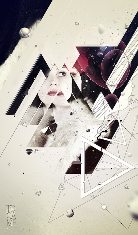
João Oliveira
Here is a piece by Portuguese artist João Oliveira. I found his artwork on the portfolio website Behance through a link in an article by Chris Spooner. João is only a couple years older than I am, but according to his description he has "been working in the various creative fields of graphic, print, editorial, web and motion design, collaborating with clients from various industries such as magazines, record labels, television, advertising, fashion, sport, luxury goods and others." so he appears to have accomplished quite a lot already at a young age.
I like how a lot of João's pieces are often based around type, and specifically numbers, as well as simple shapes such as circles and triangles. To me, the way he executes that seems to have a pretty unique look and style.
Spoon Graphics
Spoon Graphics is a company run by Chris Spooner. Similar to the designer mentioned in my last post, his website is a blog on which he posts all kind of things related to graphic design, however his blog is focused much more toward tutorials and free resources for designers. He also has several videos in which he discusses design issues and explains a bit about himself and what his workspace is like.
Because of blogs by designers such as Chris Spooner and Jacob Cass (mentioned in my previous post), I definitely see the relevance of keeping a regular design blog as suggested by this assignment and desire to do so in the future (specifically with the next website that I'll be building in Web Graphics class). Even though I'm really late in posting to this blog for History of Graphic Design, I feel like if I was keeping a regular blog for myself that wasn't a homework assignment, I probably would post to it pretty regularly. However, I'm the king of procrastination, so who knows.
Moving along, a few examples of some recent articles on Chris Spooner's page include:
20 Amazing Digital Artists to Follow on Behance,
Two Simple Techniques to Help You Master the Pen Tool, and
A Handy Guide to Image Resolutions in Print Design.
I will elaborate more on some of the artists mentioned in that first article in the list, in future posts.
Just Creative Design
So I'm extremely behind with this blog... but I'm gonna try to catch up to the required amount of posts in hopes of getting some kind of grade.
Just Creative Design is a company run by Jacob Cass. His website is a blog similar to the one we're doing for this class in which he posts interesting articles, interviews, tutorials, and things relevant to graphic design. The site also contains his portfolio and contact information. Here are a few pieces from his portfolio:
He runs another website called Logo of the Day, on which he posts logos that he has found which he thinks are particularly good, and deserve some recognition. Here are a few recent examples:
Wednesday, September 8, 2010
Packaging: CD Covers
In both of the above album covers, there is a rather large logo front and center, and an album title in smaller font near the bottom, again centered. This seems to be a very common trend at the moment for album covers, specifically when it comes to the more extreme end of the musical spectrum.
Subscribe to:
Posts (Atom)